-
Bokeh 파이썬 반응형 시각화 라이브러리 사용IT/파이썬 - Bokeh 2021. 8. 12. 22:03
최근에 그래프 그릴 일이 생겨 파이썬에 입문하게 되었다.
정확하게 말하면 책도 사고 파이썬 강좌도 찔끔찔끔 보긴 했지만 뭔가 필요해서 또는 스스로 짜보는 건 처음이다.
위 포스팅은 후발주자들을 위해 공유하는 개인 작업물이며, 직접 작성하였지만, 소스에 대해 모든 것을 파악하고 있진 않습니다.......
개발환경: Window 10, 파이참
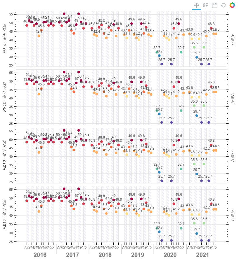
아래는 HTML로 출력된 샘플이다.
bokeh_bar_chart_page10.html0.03MBbokeh_bar_chart_page10.py0.00MBfrom bokeh.io import output_file, show from bokeh.layouts import gridplot from bokeh.models import ColumnDataSource, FactorRange, LabelSet, LinearAxis from bokeh.palettes import Spectral10 from bokeh.plotting import figure from bokeh.transform import linear_cmap TOOLS = "pan,wheel_zoom,save,reset" def create_chart(years, months, data): print(data.values()) max_data = max(max(data.values())) min_data = min(min(data.values())) print(max_data, min_data) # 컬러 설정 mapper = linear_cmap(field_name='y', palette=Spectral10, low=min_data, high=max_data) # 그래프 병합데이터 설정 x = [ (year, month) for year in years for month in months ] air_data = sum(zip(data['01'], data['02'], data['03'], data['04'], data['05'],data['06'], data['07'], data['08'],data['09'], data['10'], data['11'], data['12']), ()) source = ColumnDataSource(data=dict(x=x, y=air_data)) p = figure(x_range=FactorRange(*x), plot_height=350, title="", toolbar_location="above", tools=TOOLS) p.circle(x='x', y='y', width=0.9, source=source, color=mapper, line_width=5) # circle= Circle(x='x', y='y', width=0.9, source=source, color=mapper, line_width=5) # p.add_glyph(source, circle) # 그리드 패턴 넣기 p.xgrid.band_hatch_pattern = "/" p.xgrid.band_hatch_alpha = 1 p.xgrid.band_hatch_color = "#e5e5f2" p.xgrid.band_hatch_weight = 1 p.xgrid.band_hatch_scale = 10 # y축 좌측 텍스트 p.yaxis.axis_label = "PM10 - 황사 제외" # y축 우측 텍스트 p.add_layout(LinearAxis(axis_label="서울시", major_label_text_font_size="0px"), 'right') # 데이터 상단 텍스트 추가 top_data_labels = LabelSet(x="x", y="y", text="y", y_offset=8, text_font_size="12px", text_color="#555555", source=source, text_align="center") p.add_layout(top_data_labels) # x축 제거 p.xaxis.visible = False p.x_range.range_padding = 0.1 p.xaxis.major_label_orientation = 1 # y축 시작높이, 끝높이 설정 # p.y_range.start = 0 # p.y_range.end = 80 return p years = ['2016', '2017', '2018', '2019', '2020', '2021'] months = ['01', '02', '03', '04', '05', '06', '07', '08', '09', '10', '11', '12'] data = {'01':[48.5, 50.4, 46.8, 43.1, 32.7, 43.6], '02':[51.4, 48.4, 43.2, 41.1, 30.7, 40.6], '03':[50.5, 55.4, 42.4, 45.6, 25.7, 35.6], '04':[48.5, 50.4, 47.4, 49.6, 42.2, 29.7], '05':[49.5, 51.4, 48.8, 43.2, 41.1, 40.6], '06':[42.4, 45.6, 43.8, 41.2, 40.1, 25.7], '07':[45.6, 43.8, 41.2, 40.1, 25.7, 35.6], '08':[50.4, 49.0, 47.4, 49.6, 46.8, 42.2], '09':[50.5, 55.4, 45.6, 43.8, 41.2, 25.7], '10':[48.5, 50.4, 49.0, 47.4, 49.6, 46.8], '11':[49.6, 46.8, 42.2, 43.1, 32.7, 43.6], '12':[48.5, 49.6, 46.8, 42.2, 43.1, 43.6]} p1 = create_chart(years, months, data) p2 = create_chart(years, months, data) p3 = create_chart(years, months, data) p4 = create_chart(years, months, data) p4.xaxis.visible = True p4.xaxis.group_text_font_size = "20px" p4.xaxis.major_label_text_font_size = "10px" output_file("bokeh_bar_chart_page10.html") p1.plot_width = 800 p1.plot_height = 200 p2.plot_width = 800 p2.plot_height = 200 p3.plot_width = 800 p3.plot_height = 200 p4.plot_width = 800 p4.plot_height = 250 gp = gridplot([[p1], [p2], [p3], [p4]]) show(gp) # open a browserbokeh나 파이썬에 익숙치 않아 데이터도 전부 하드코딩으로 처리했는데, 이후에 pandas 등을 이용해서 조금 더 발전시켜볼 예정이다.
참고사이트: https://docs.bokeh.org/en/latest/docs/gallery/legend.html
'IT > 파이썬 - Bokeh' 카테고리의 다른 글
파이썬 Bokeh 이미지 다운로드 파일명 변경 (0) 2021.11.13 Bokeh 파이썬 반응형 시각화 라이브러리 사용 (pandas, csv) 작업물(막대그래프) (0) 2021.08.22